📢 Now taking new project for September, book an intro call today 📲
Designing the Perfect Website Home Page – Complete breakdown in 8 sections
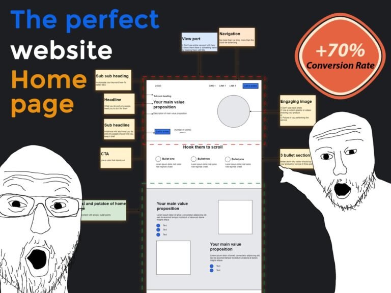
Designing the Perfect Website Home page is no easy task luckily after designing over 50 websites in the past 3 years, I can proudly say I know one or two things when it comes to optimizing conversion rate and increasing the time visitors spend on your site. In the following article, I’m going to walk you through the perfect home page layout, we’re going to go through section by section along the way, I’m also going to share some tips that will completely change the way you design pages. So, let’s get started
1. The navigation
Our navigation does not have to be super complex typically, you should have your logo on the top left and your links and call to action to the top right. There are times where you can place your links in the middle but this does go against standard web design conventions meaning that it is not what people are used to. Make sure you have your navigation as familiar as possible and that people know exactly what they are looking for and how to find it. Make sure you call to action stands out from the other links. Also make sure you don’t have more than 3-4 links sometimes for big websites you can do otherwise but just make sure your links are not overwhelming
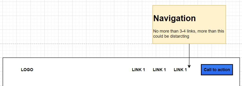
For example

2. Hero section
This is by far the most important section of your website, we cannot be designing the perfect website home page and fail this section mainly because this is the only part of your website all visitors will see and it’s pretty discouraging to know that often times the vast majority of people (70% of website visitors) who visit your website will never scroll past this section. Therefor in this section we need to tell visitors what we do, how we do it, why they should choose us. We need to have some type of value proposition, that encourages them to reach out to us. And we need to have a powerful call to action (CTA). So thereùs a lot to accomplish in the hero section and we need to make sure we are precise about what we put here.
So here we have:
- Primary Heading
Our primary heading which is our main value proposition, you want to keep it short and “punchy” but also very engaging. You can study those of very big company websites like Starlink, Amazon etc. Usually you will have to A/B test this, to figure out which exact sentence converts the most. If nothing else is read on our entire website, this section should tell people what you do and why people need you to do this for them.

2. Secondary Heading
This is our supporting heading, used to provide more information about what you do, how you do it and why people should work with you. It should be brief and make sure you are not just restating what you already said in your headline, people don’t want to read the same things twice therefore make sure you use this space to add additional information that can encourage visitors to convert

3. Call to action (CTA)
Make sure to use a color that stands out (high constrast) so that people see it. On the side you can have some type of social proof (maybe number of clients, projects, maybe google business ratings etc.)

4. subheading
Use this heading to incorporate your h1 keyword, this is not always necesary because you can still add your h1 keyword in your primary heading

5. Visual
On the right you have an image or video. Make sure you have an engaging image, make sure you don’t use a stock photo, those don’t work well as visitors can easily spot them from miles away. Try to have some kind of custom graphic showcasing your product or service or even better a picture of you actually performing the service, this is something that willl build alot of trust. The same goes for any place on your website where you want to place an image also keep in mind and animated visual (gif or video) is always better than a static graphic

N.B: Take a look at the image below
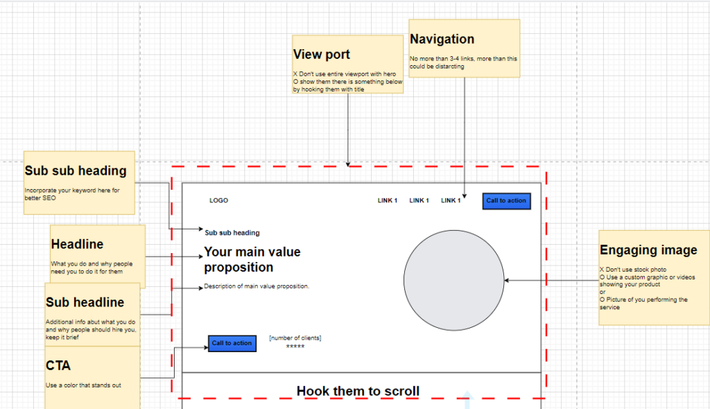
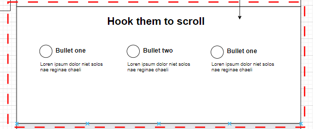
The hero section shouldn’t cover the entire viewport. As you can see in the image above, the heading of the following section is visible (as it is inside the red dashed box). The reason for this is to indicate to visitors that there is more content below the hero section and to engage them to scroll.
“Hook them to scroll” is a heading that will make your visitor thinks “oooh i have to scroll to see what they are talking about below”
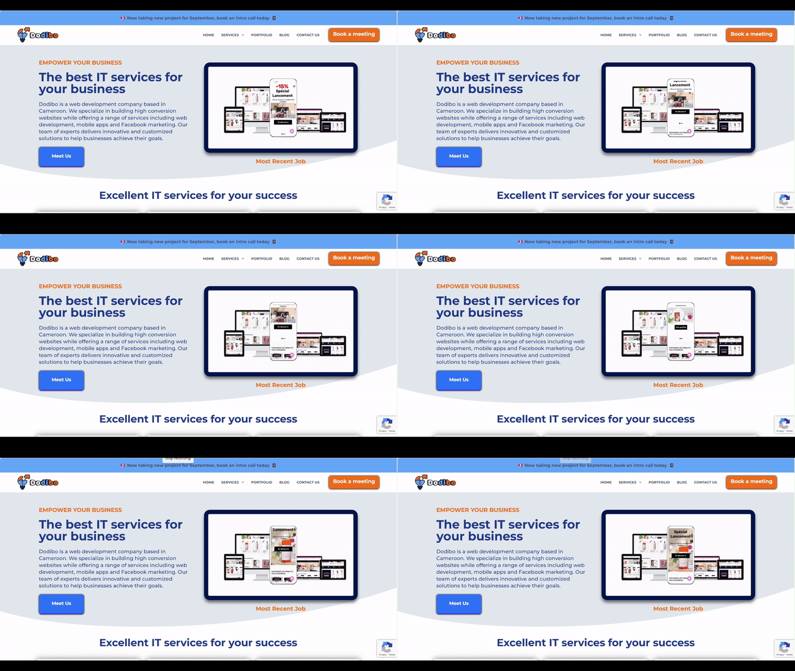
So basically a near perfect hero section looks like this
3. Three bullet section
This is a very common element in most websites because it can convey alot of information without taking much space by utilizing this three column layout. Most of the time each column comprises a header, an icon and a description. It must not necessarily be three columns, some times it could be two or four but the idea is not to overdo it with too many columns because people are not going to read that much contain
For example

4. Meat and potato of the home page
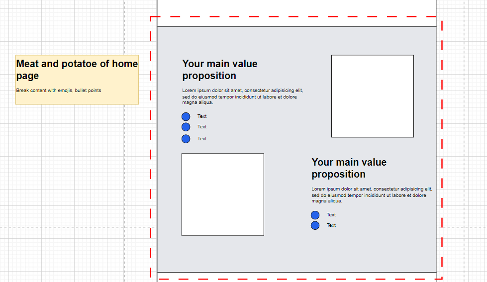
This is where you are going to convey a lot more information about the product or service you are offering. Designing the perfect website home page involves having a substantial “meat and potatoes” section: You will show more image, videos, present the features etc. Therefore, there is a lot more content in this section. You will need to break down this content appropriately such that you don’t end up with a big block of text and tons of paragraph because nobody will read that.
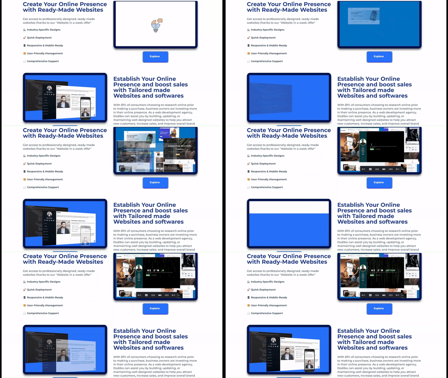
We live in the age of shorts and TikTok videos where if something doesn’t catch your attention in the first 10 seconds you move on. I usually like to use a two-column layout like below. This section comprises of a heading, a description and some bullet points with and image on the other side. Make sure to break up content with paragraph breaks, bullet colors and even emojis. Emojis are really awesome they make people more comfortable, add colors and breaks up text making reading more fun, don’t be afraid to use this inside your web design.
For example
5. Social Proof
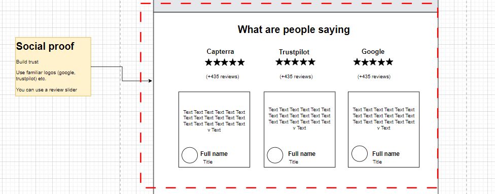
Social proof is a must when it comes to designing the perfect website home page. This is where we display reviews, testimonials, showing visitors our reputation and reviews portfolio. There are a lot of different ways to show this, sometimes it makes sense to just throw as much as possible, sometimes we need to add a scroller such that visitors can see more if they need to. It is good practice to use logos that people know and recognize e.g. Google, Capterra, Trustpilot etc. And add the number of reviews below. The below you could select and display your three best testimonials and display it.
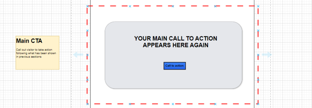
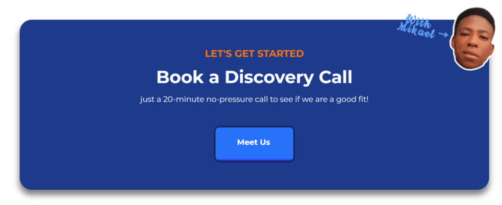
6. Main call to action
So far we have presented the value proposition (Hero section), we’ve given visitors more reason to “buy” in the three bullet section, we have presented the features of the product/service (meat and potato) and we have given some social proof. Now it is time to call out the visitors to take action again hoping that they are convinced to take action
7. Frequently asked question (FAQ)
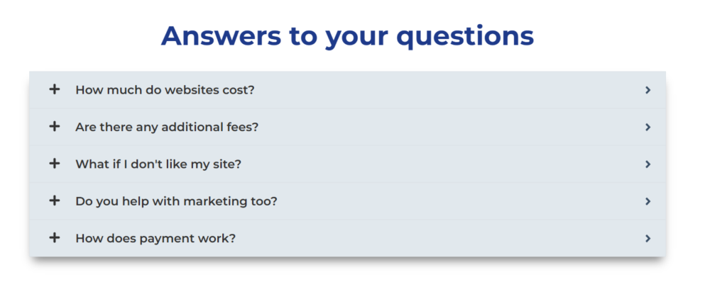
Below the main call to action, visitors can have answers to frequently asked questions to cast away any doubt

8. Footer
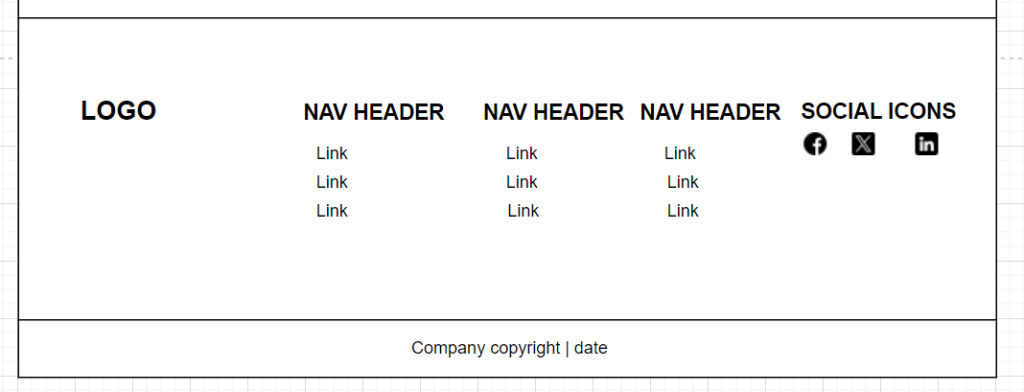
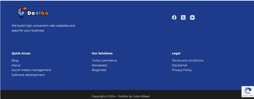
Finally at the bottom of your page we have the footer, this section can hardly be done wrong since it doesn’t really have any conversion function, so regardless of how you set it up just make sure it is organised, each column represents a specific category with a header and links below. Display your social buttons and your logo on the left going linking to your home page
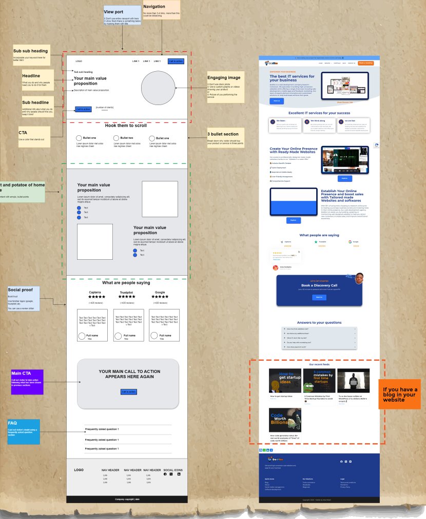
TADAAAA…. This is basically the setup of our homepage 🙂
Instead of criticising write the variants.
I consider, that you are not right. I am assured. I can prove it. Write to me in PM, we will communicate.
Hello, What i wrote in this article is quite subjecive but I believe it has consistently proven to be a good design choice